Brand Identity
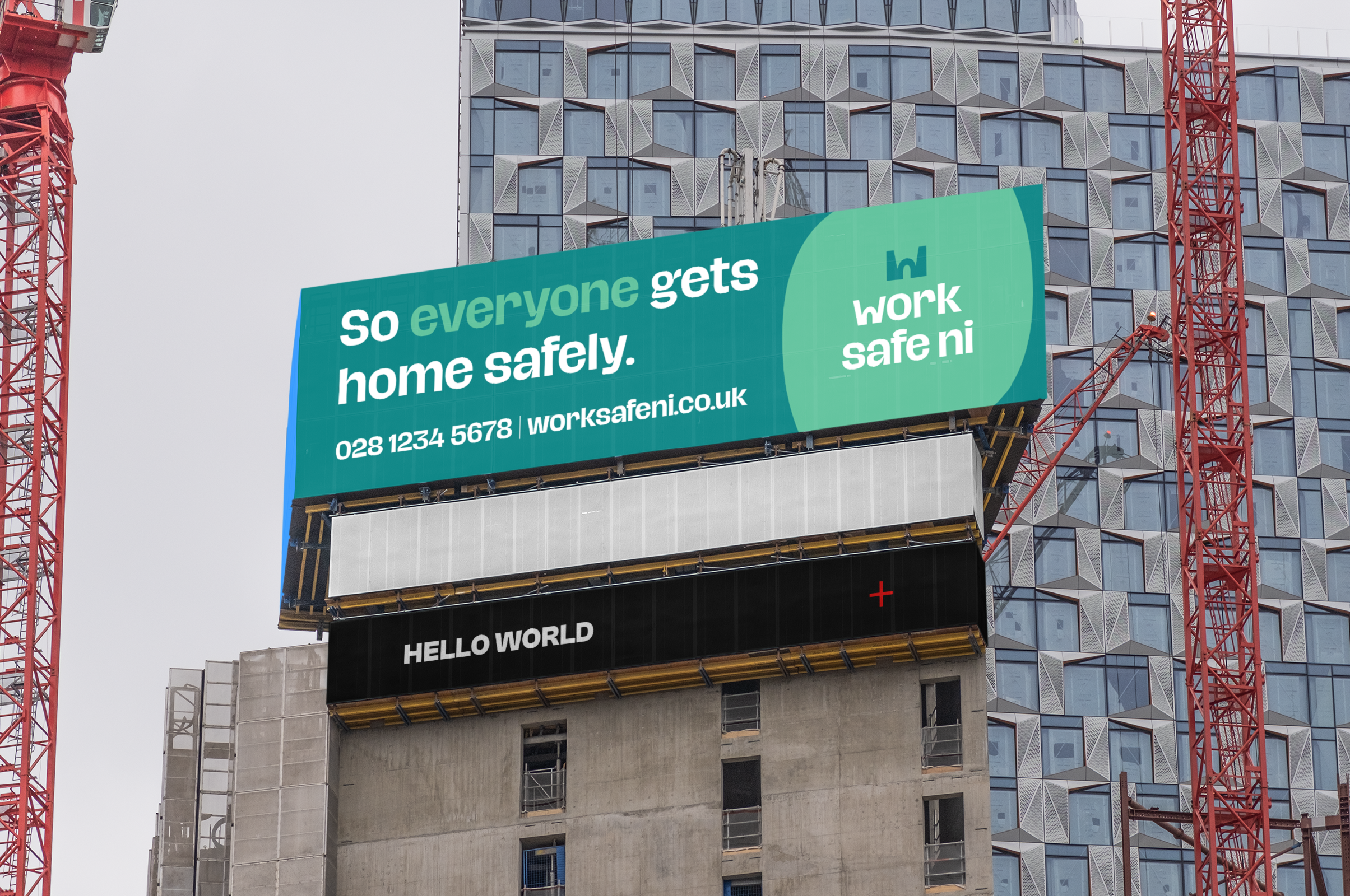
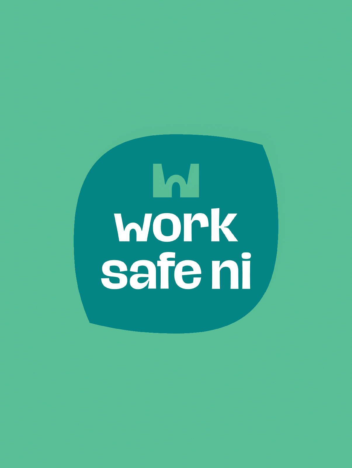
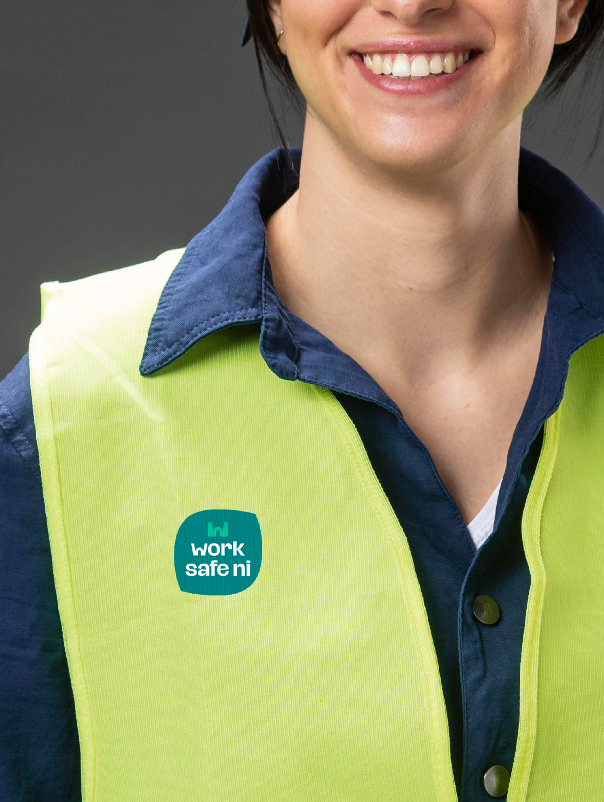
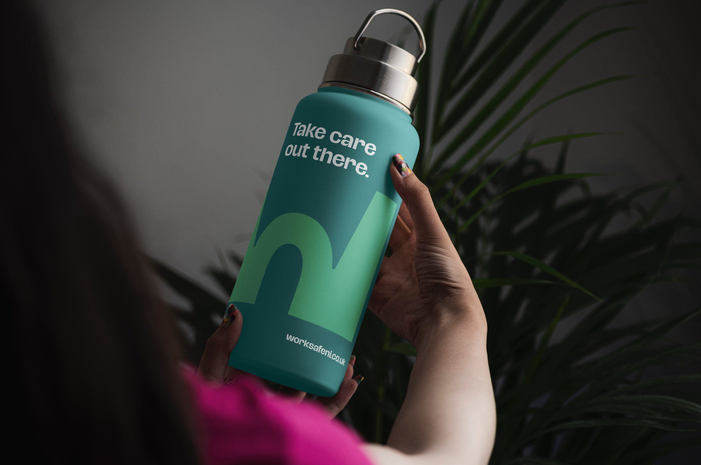
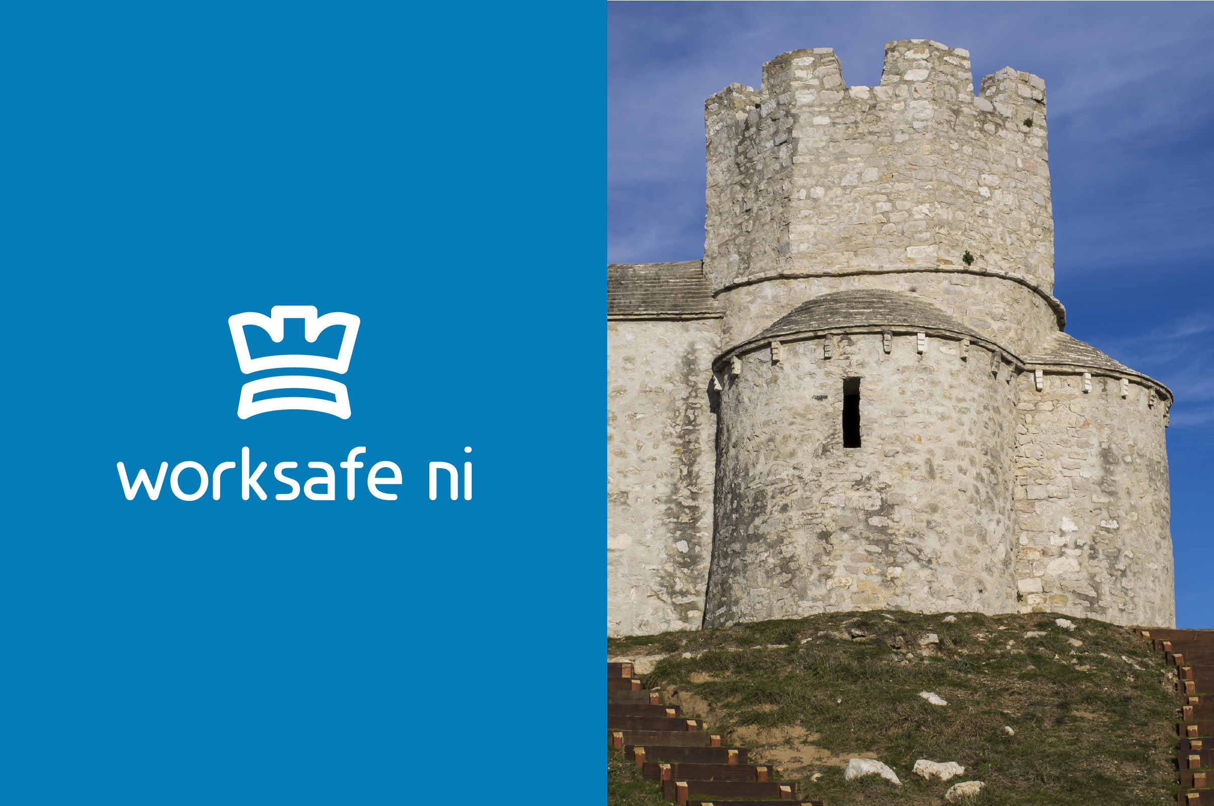
Work Safe NI
Health & safety is a crowded market, so it is crucial to build a memorable identity. Most identities feel cold and corporate, but newcomer Work Safe NI wanted to stand out from the rest.
Goal:
Develop a brand identity that feels human and differentiates from competitors.
Outcome
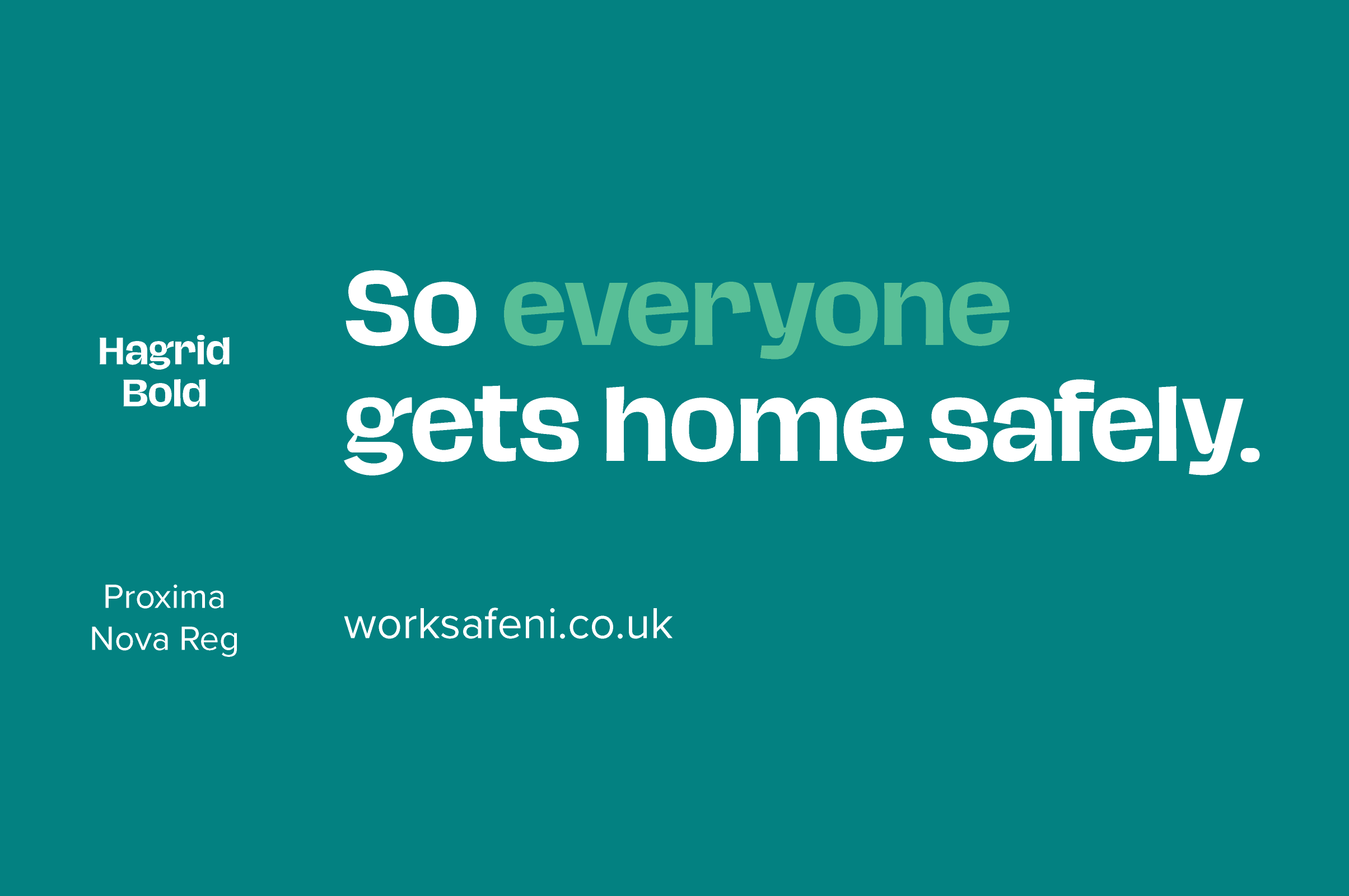
• Human typeface builds trust.
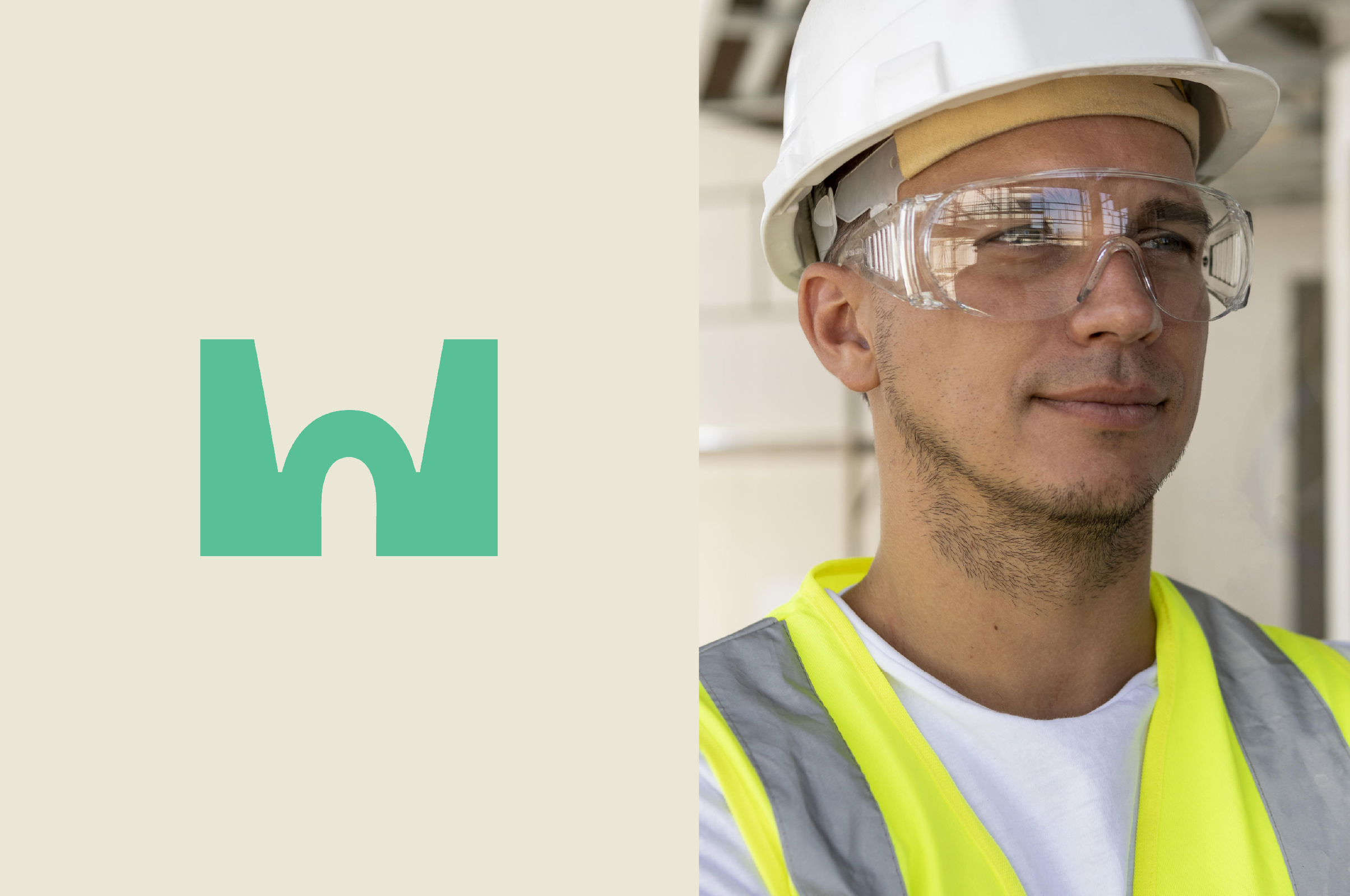
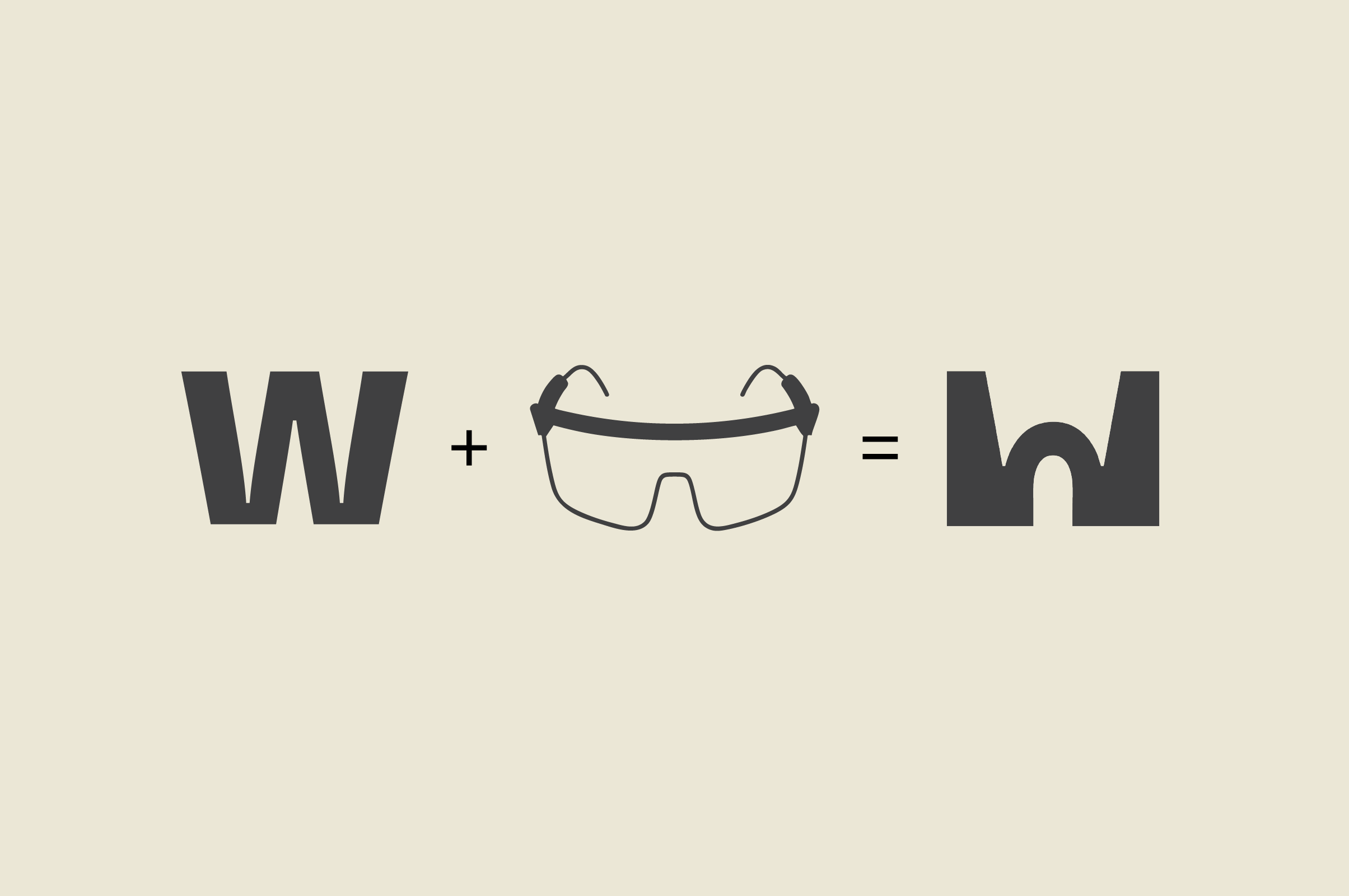
• Icon inspired by the bridge on safety goggles.
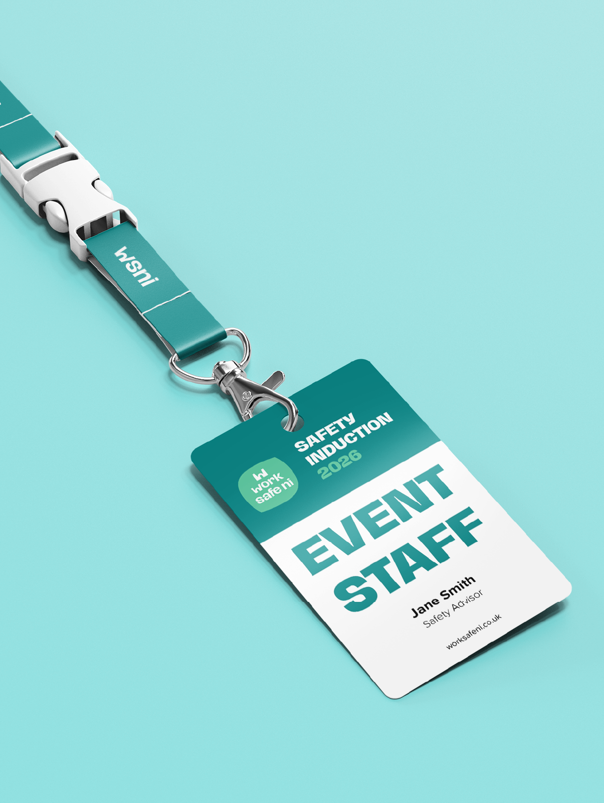
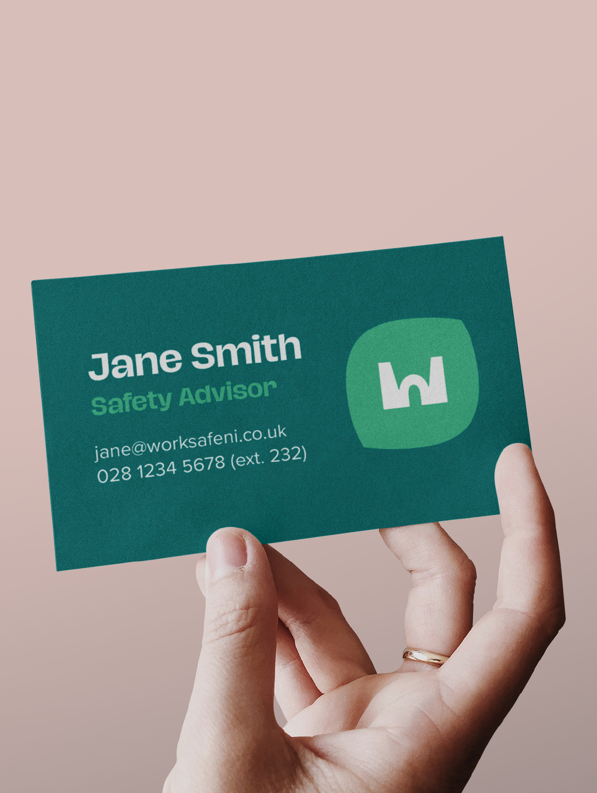
• Shades of teal signal health and wellbeing without coldness.
• Tone of voice feels reassuring. Friendly rather than a voice of authority.
Key Ideas & Decisions
I started by gathering information to help make design decisions. The goal was to differentiate from the typical health & safety organisation, so analysis of existing brands was important, as well as identifying the audience and understanding their needs.
Competitors
• Corporate blue palettes.
• Generic icons (shields, checks).
• Formal, impersonal tone.
• Low differentiation.
Business owners & managers responsible for health and safety but not specialist:
• Want clarity, not jargon.
• Prefer support over enforcement.
• May feel intimidated.
Alternative Concept
• Strengthen trust in a new brand.
• Signalled with turret motif.
• Rounded typeface feels less intimidating.