UI Design & Branding
Snapd Mobile App
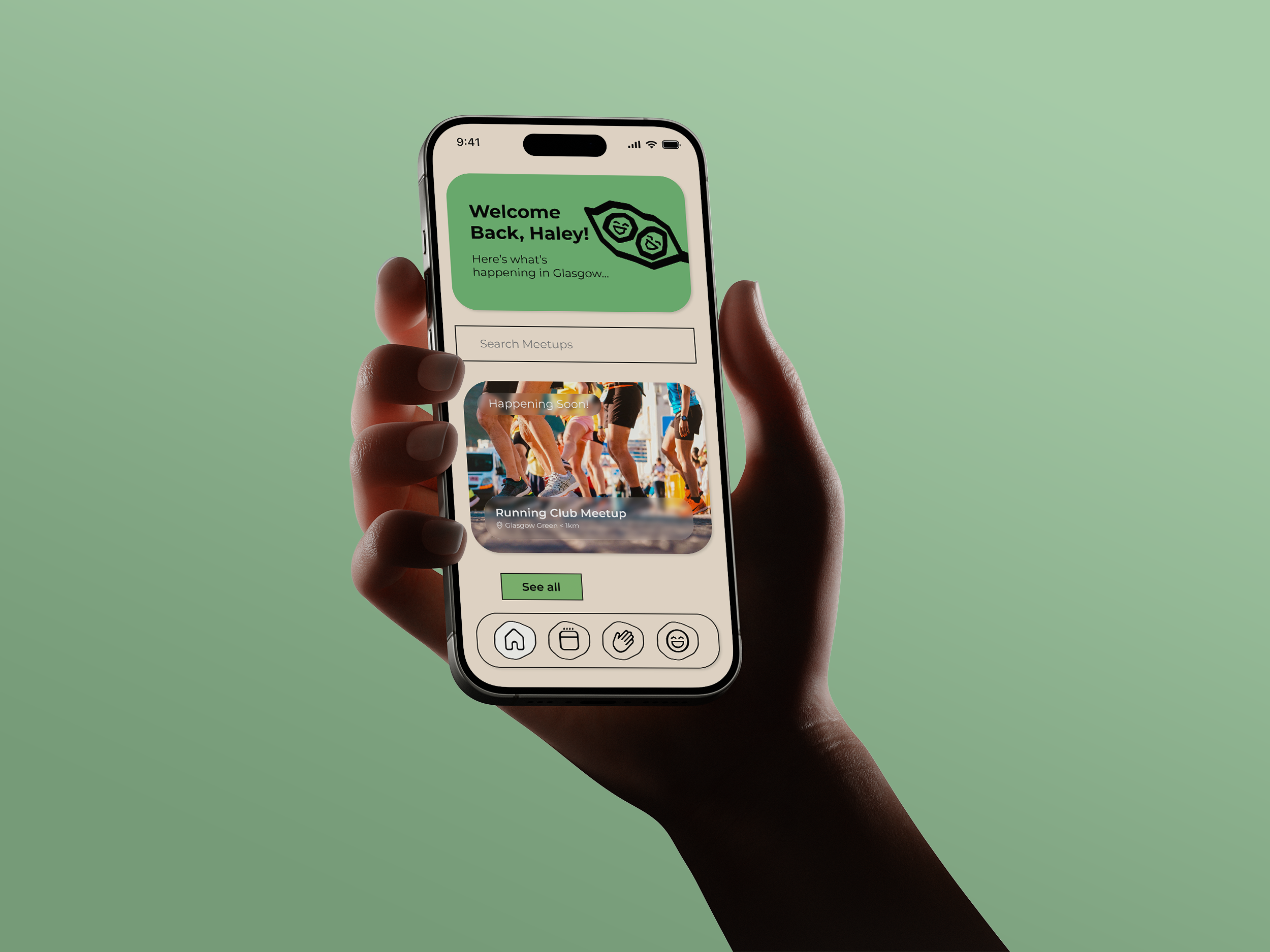
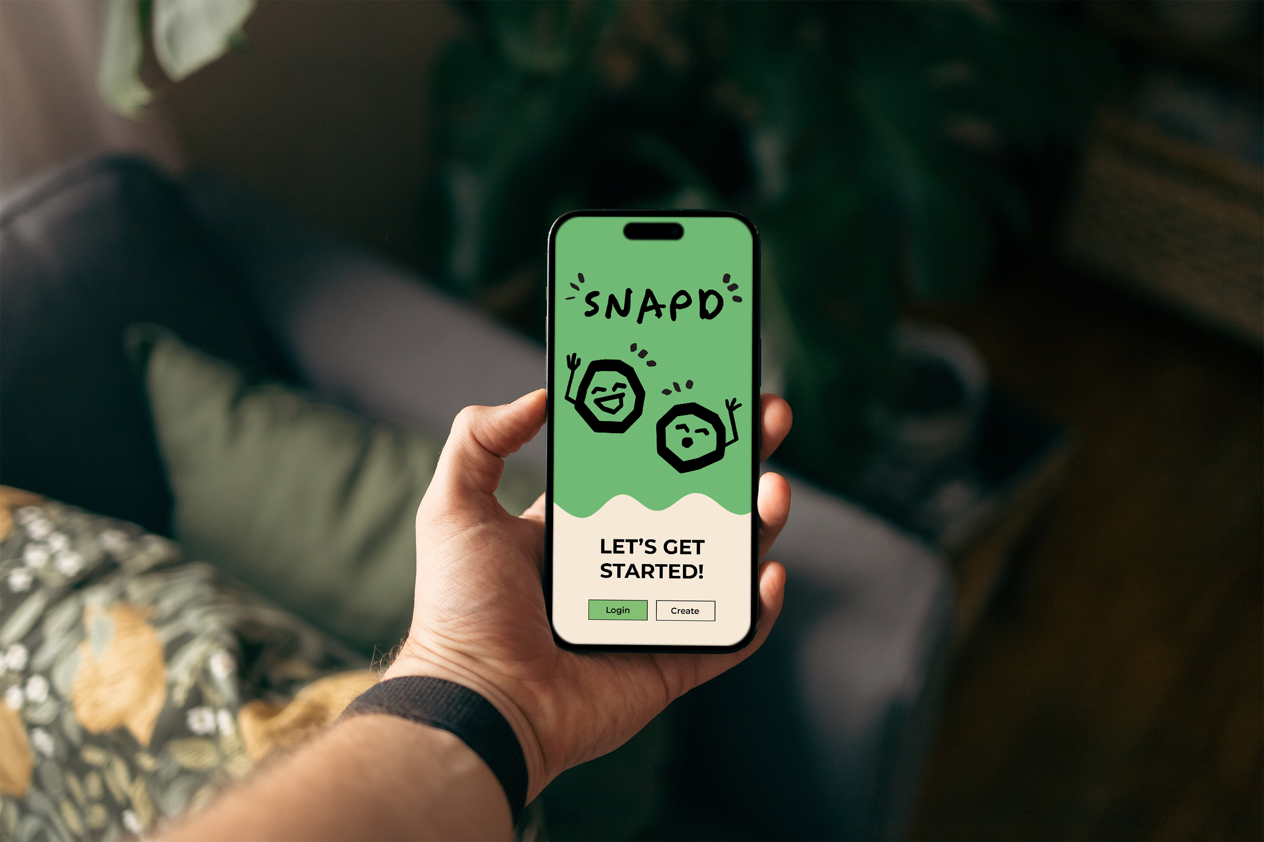
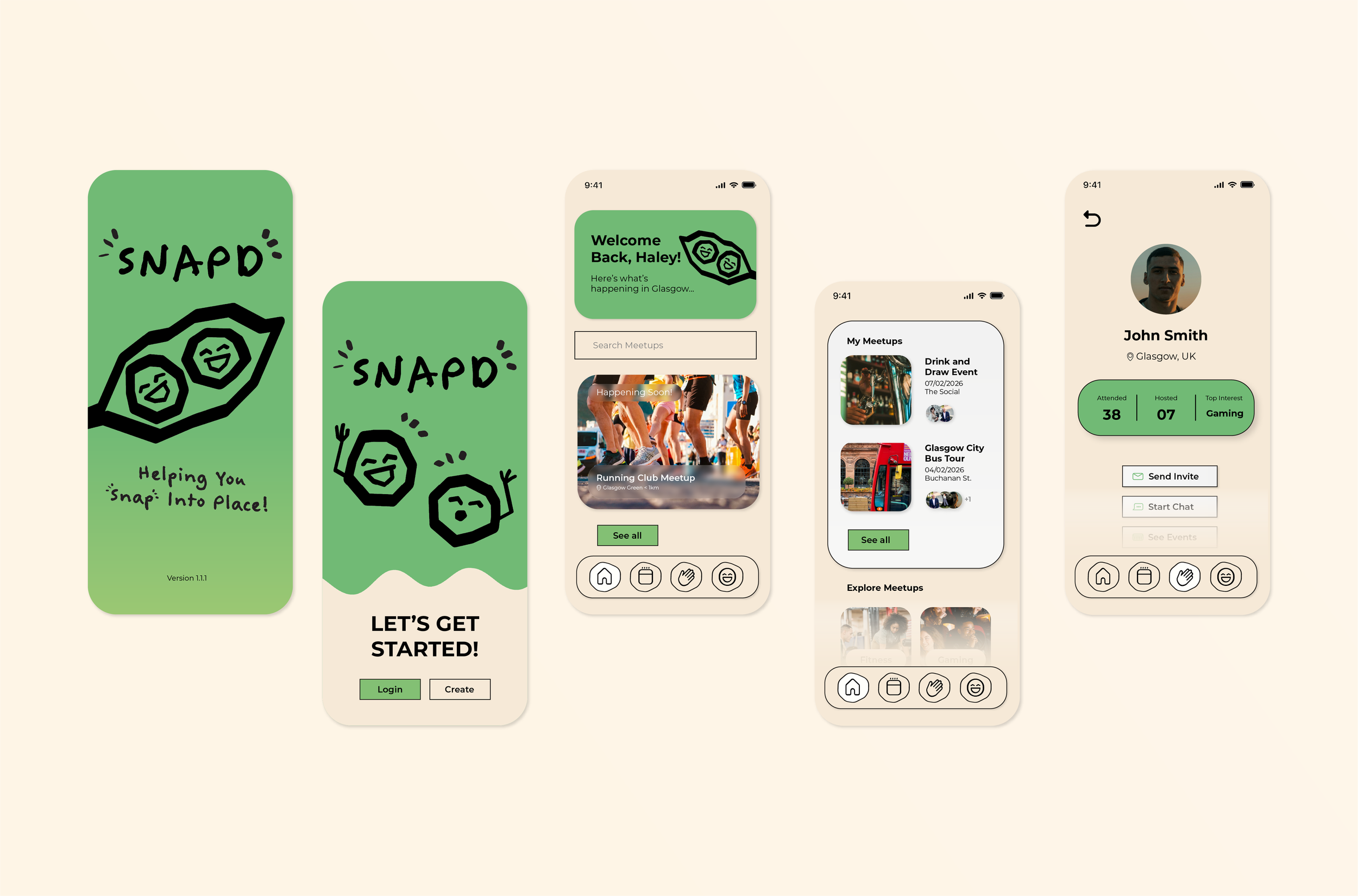
Snapd is a conceptual mobile app - a community-building app for people new to a city. The experience intentionally avoids social-media and dating-app patterns by excluding endless scrolling and likes, and instead focuses on real connection through a welcoming, approachable interface.
Try out the Figma Prototype here (WIP).
Key Ideas & Decisions
By listing some key word associations, I identified a set of short, memorable names to start the process. Words like ‘Click’ & ‘Snap’ worked because they symbolise coming together. I decided on ‘Snapd’ to avoid confusion with other apps, and to steer away from the association with ‘clique,’ which would be contrary to the values of the brand.
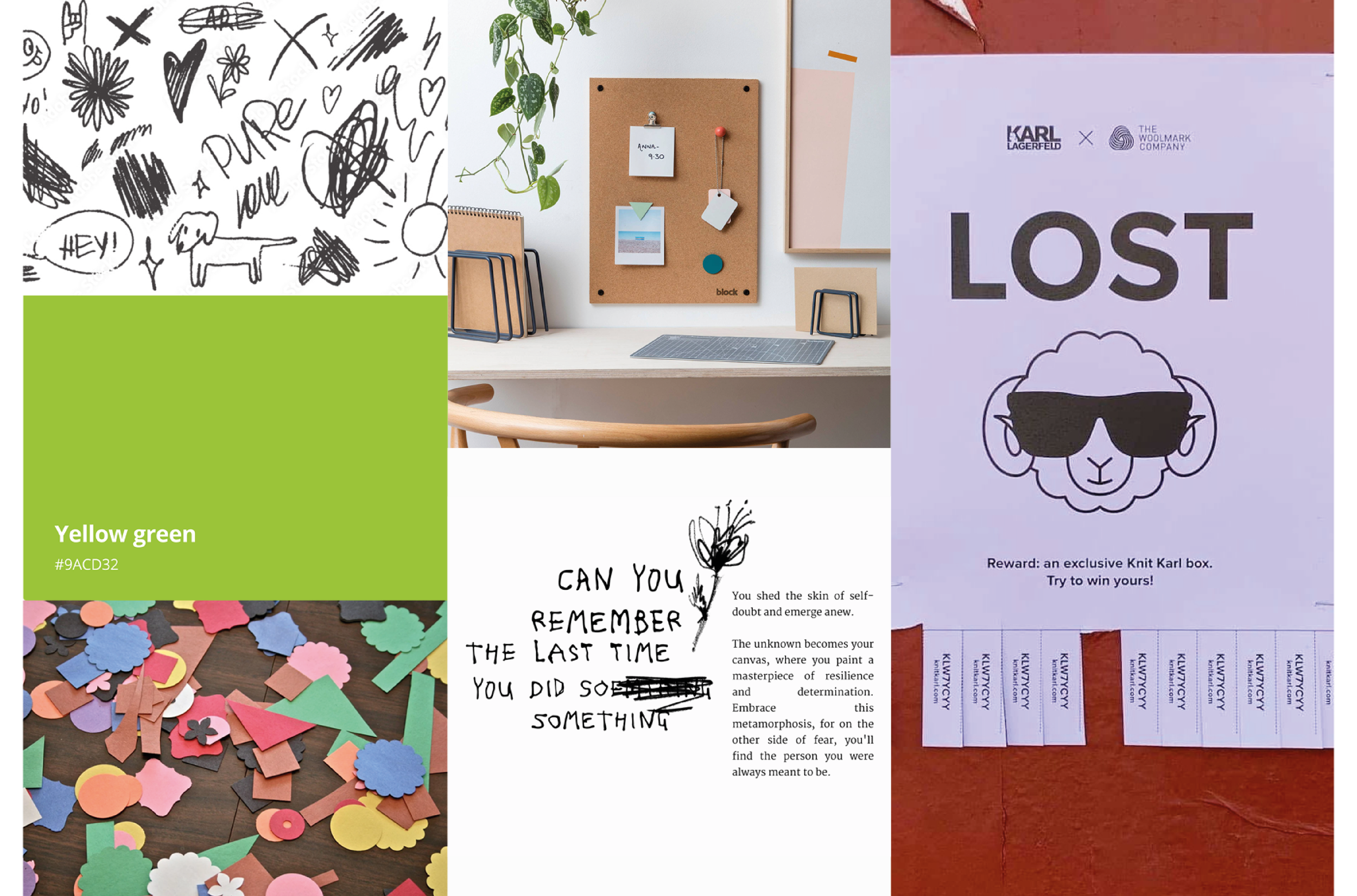
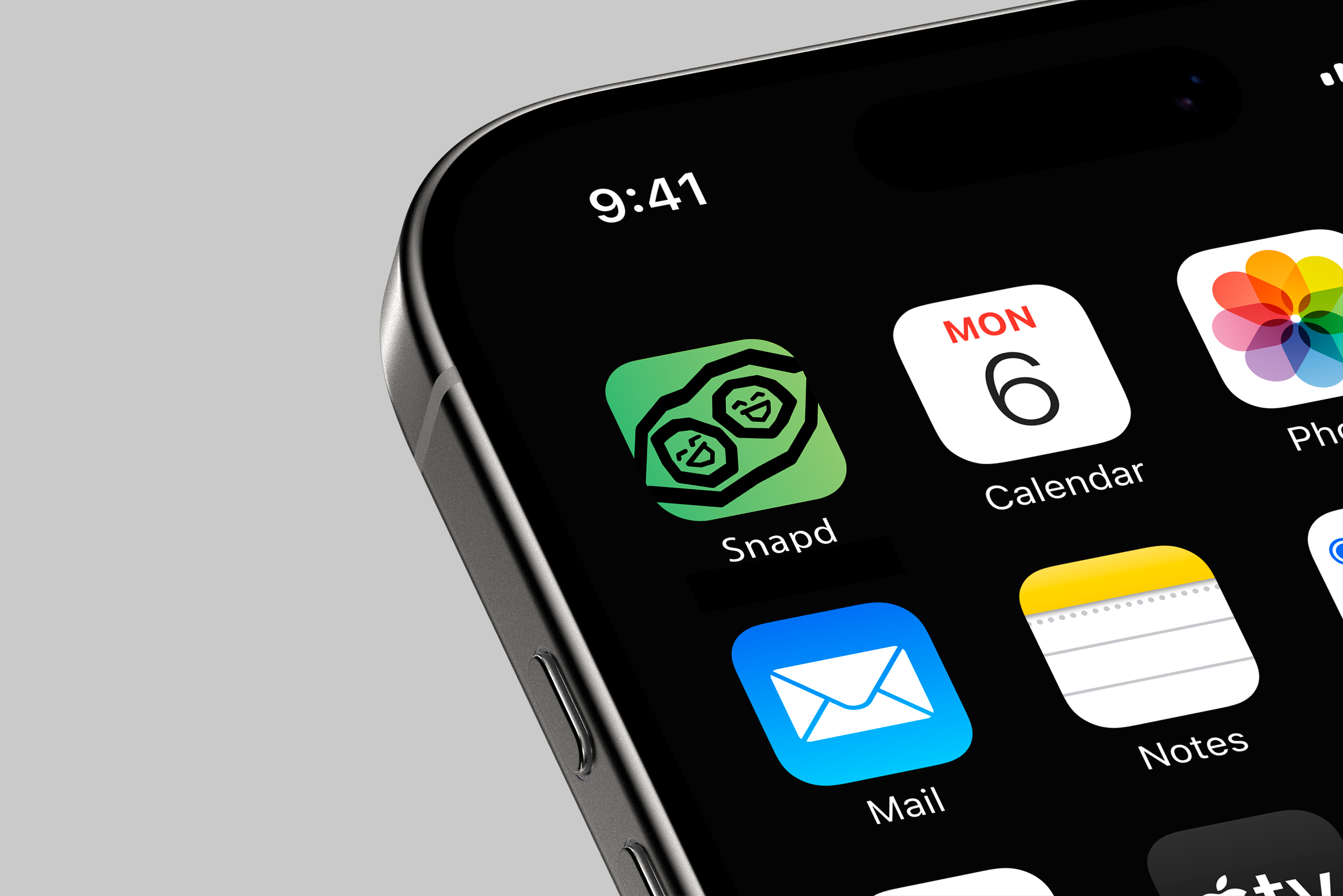
The visuals were directed by the goal of creating a welcoming and playful app design, focusing on hand made, doodle style sugar ‘snap’ pea illustrations. The doodle style was chosen in reference to posting events on notice boards.
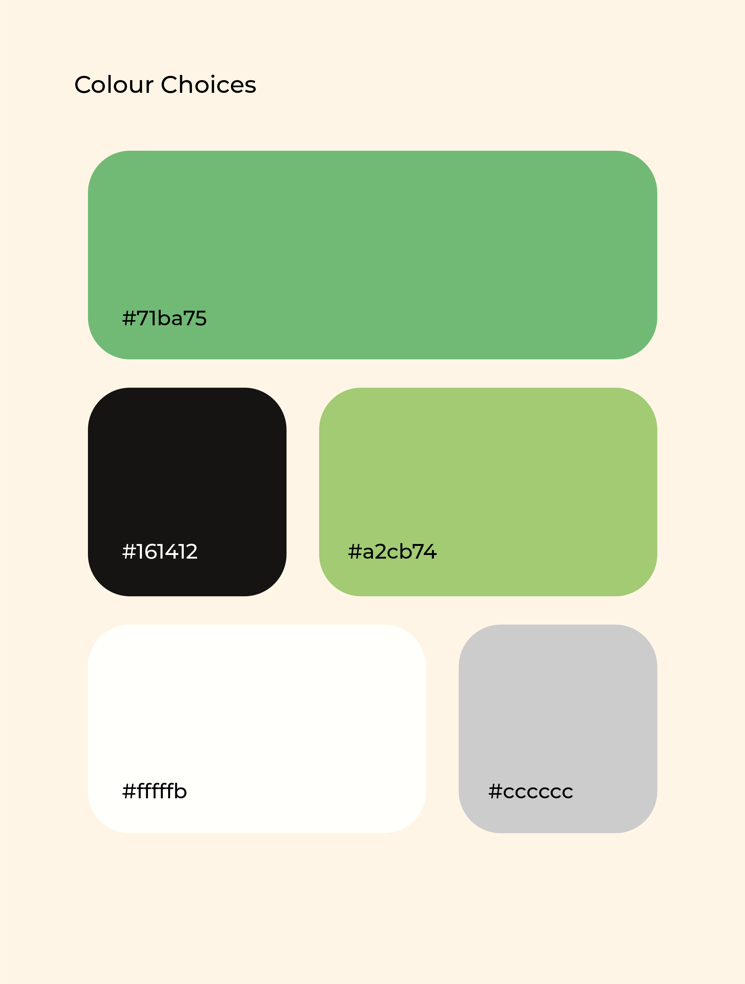
A slightly muted green was chosen to represent safety, a main concern for those moving to new cities and meeting people they don’t know online. This is complimented with other muted colours, including off white and black for contrast.
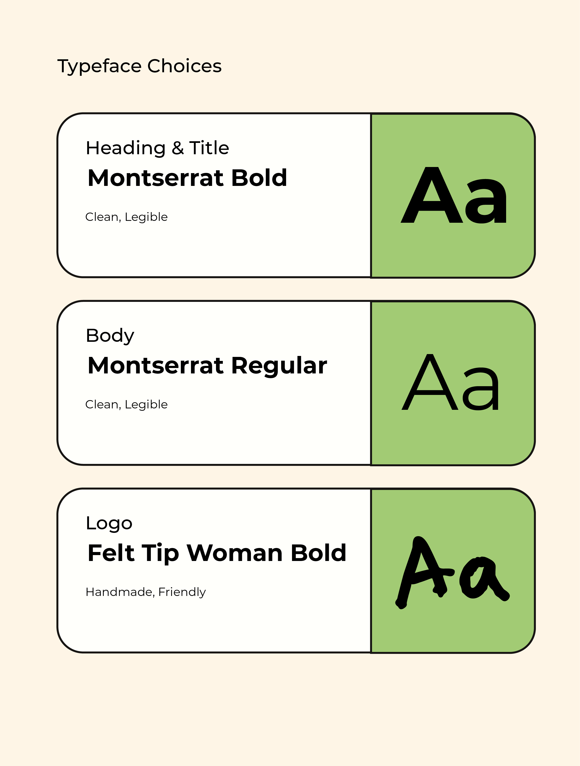
A handwritten typeface was fitting for the logo, but I chose to use the more legible Montserrat as a secondary typeface for the app design. Various weights are used to establish hierarchy.
I had thought about using puzzle pieces as the visual direction for coming together, but decided that the ‘snap’ direction seemed more neutral and welcoming.