
Brand Identity
Above the Noise Urban Gardens
I developed a full brand identity for Above The Noise, a fictional urban-gardening startup focused on helping city residents create calming, sustainable green spaces at home. The goal was to craft a modern, approachable visual system that reflects the brand’s values of simplicity, sustainability, and accessible design.


Key Ideas & Decisions
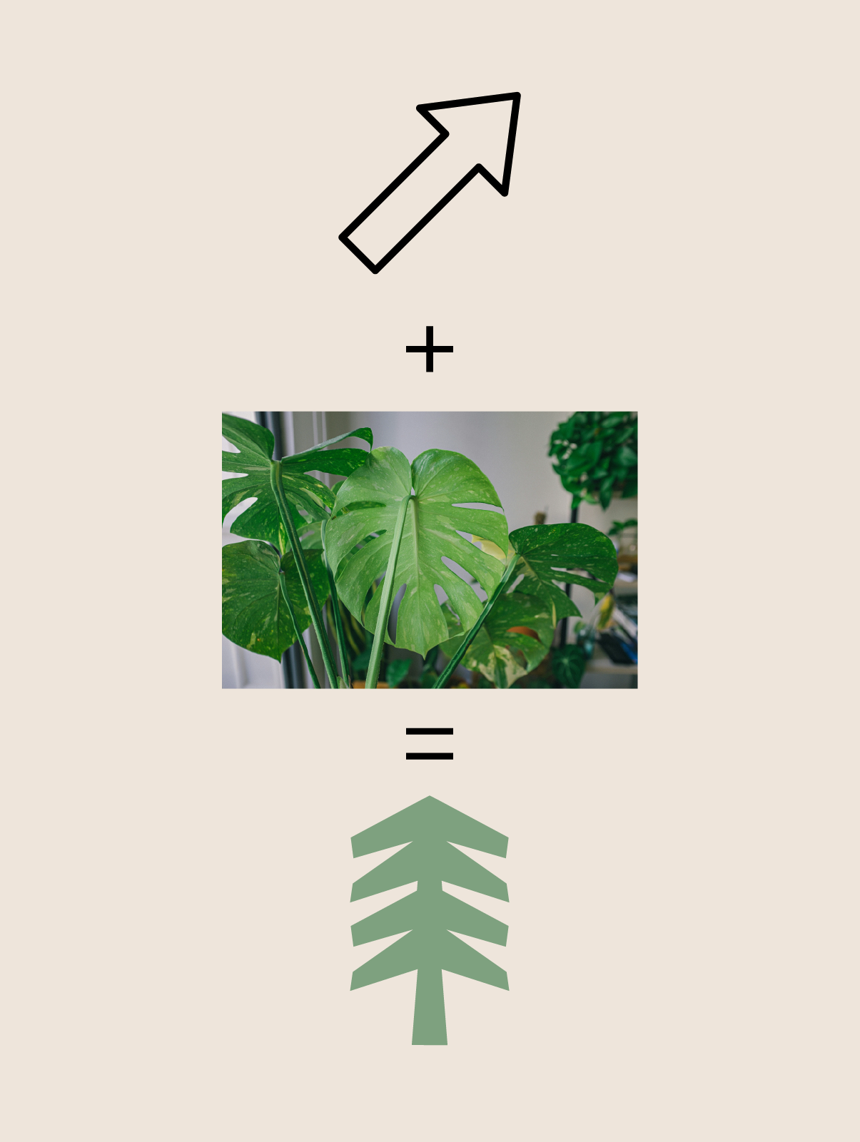
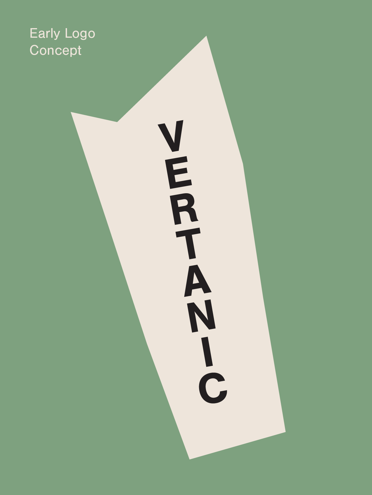
My initial ideas explored the contrast between the worlds of man made architecture and the nature. These angles focused on mechanical typefaces paired with organic shapes and natural curves. However, the decision was made to focus on a more audience driven approach.
The name ‘Above The Noise’ directly addresses the pain point faced by the target of this brand - creating quiet, calming spaces away from the constant bustle of the city.
This feeling of escape is achieved through a calming, neutral colour palette. The contrast between soothing and busy typefaces helps to enforce the idea of the viewers own personal safe space within a noisy world.