
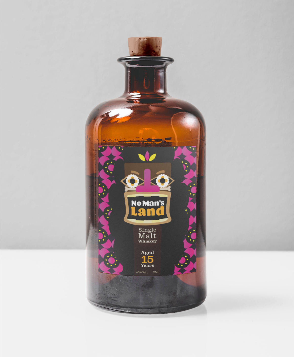
Brand Identity
No Man’s Land Whiskey
A self-initiated project to reimagine whiskey branding for a wider, younger audience. Inspired by surf culture, the goal was to break away from traditional, formal whiskey visuals and create a fresh, approachable, and adventurous identity that resonates with modern, lifestyle-focused consumers.


Process & ideation
I began by researching my target audience and quickly translating ideas into thumbnail sketches.
I began by researching my target audience and quickly translating ideas into thumbnail sketches. Surfing culture and tropical island imagery provided key inspiration, while common surfing expressions sparked creative directions.
I ultimately focused on the tiki mask/totem pole concept, leveraging its spiritual symbolism to cleverly link the product to the idea of “spirit,” bridging culture, lifestyle, and wordplay in a playful, meaningful way.


